Spiders Versus Unicorns – Cutting Room Floor
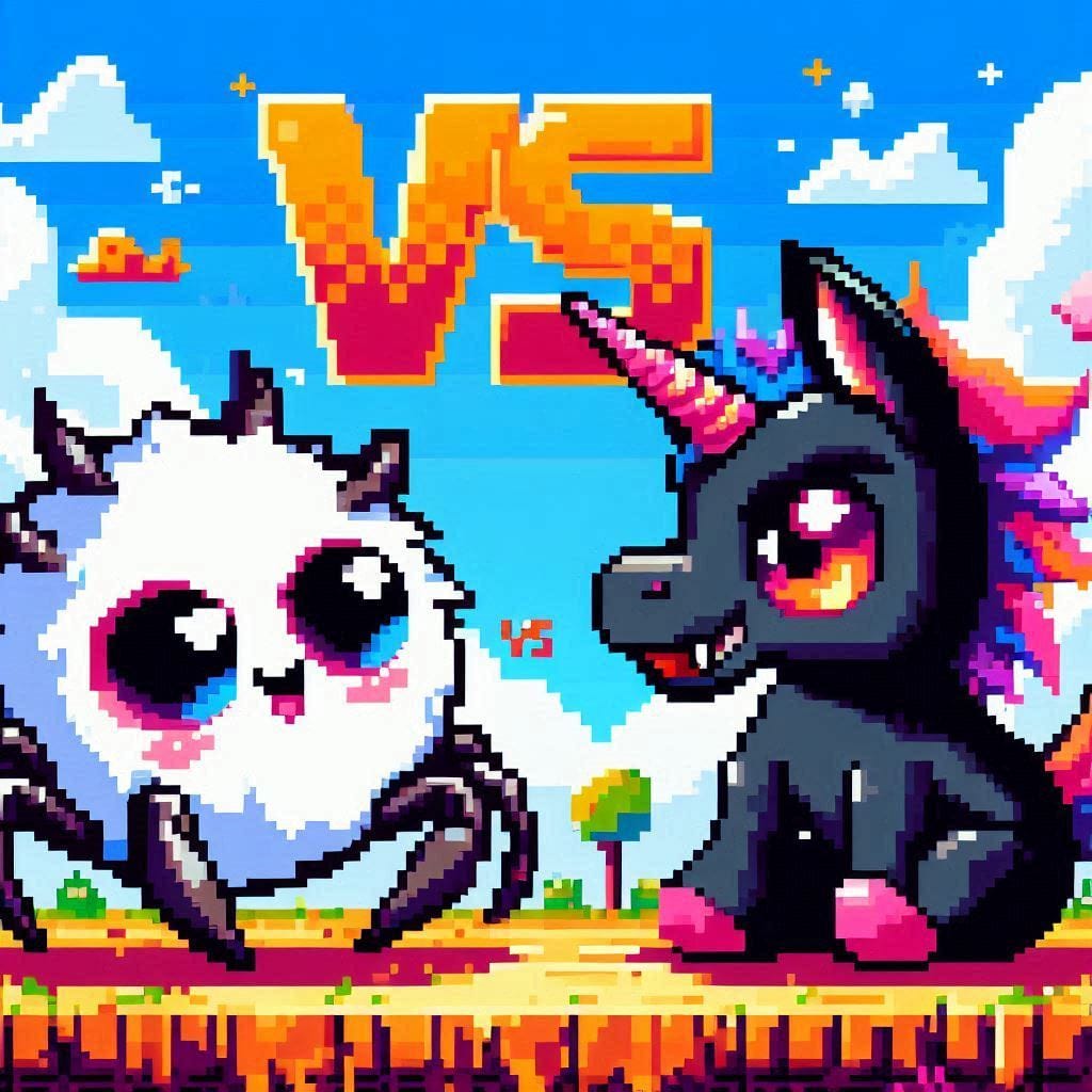
Unused game cover images for the game – Spiders Versus Unicorns
     |
Description
Spider vs Unicorns may sound like somebody shuffled fantasy creatures and Halloween decorations together at random, but the unused cover art for the game tells a much stranger story. Hidden away in early development folders are alternate logos, abandoned promotional mockups, and experimental covers that transformed the game into everything from a chaotic party brawler to a fake Saturday morning cartoon from another dimension. This Cutting Room Floor gallery gathers those forgotten designs together before they disappear into the web forever. 🕷️🦄
The final version of Spider vs Unicorns embraces absurdity with confidence, throwing players into a bizarre clash between creepy crawlers and aggressively magical unicorns. The unused covers, however, reveal that the project originally explored wildly different visual directions before settling on its final tone. Some concepts leaned heavily into fantasy adventure aesthetics, presenting the unicorns as noble glowing warriors standing against swarms of oversized spiders emerging from enchanted forests. Other versions flipped the balance entirely, transforming the spiders into giant horror creatures with glowing eyes and tangled cave environments that made the game feel more like a survival title than a comedy experience.
One abandoned cover design resembled an old arcade cabinet poster, complete with dramatic lightning bolts, exaggerated action poses, and glowing energy attacks bursting across the background. Another prototype looked almost suspiciously cheerful, using pastel colors and rounded cartoon lettering that gave the impression of a children’s puzzle game moments before total arachnid disaster unfolded. A few unused mockups even experimented with retro pixel-art presentation styles, covering the scene in chunky sprites and exaggerated retro gradients that screamed “lost multiplayer game from 1997.”
The typography went through its own strange mutation cycle. Early logos used sharp gothic lettering with spiderweb textures stretched across the text, while later concepts shifted toward bubbly fantasy fonts dripping with rainbow effects and sparkles. One experimental version tried combining both styles at once, creating a logo that looked like a heavy metal album had collided with a toy store aisle during a magical storm. Somehow, it almost worked.
Unused covers like these offer more than simple visual leftovers. They preserve alternate creative identities that almost became the face of the game itself. Tiny changes in color, composition, or logo design completely altered the tone, shifting Spider vs Unicorns between parody horror, fantasy chaos, retro arcade energy, and pure internet-era nonsense. Browsing these unused concepts feels less like viewing discarded artwork and more like peeking into branching timelines where the game evolved into entirely different species.
Featured Images
Latest Images
Random Images
Oldest Images